
Introduction
I vividly remember my first attempt at using patterns in interior design—it was a disaster. I fell in love with a bold geometric wallpaper and decided to pair it with a vibrant floral rug. Add in striped throw pillows, and let’s just say my living room looked like a circus tent instead of a stylish haven. I learned a valuable lesson that day: working with patterns is an art, and when done thoughtfully, it can completely transform a space. Over the years, I’ve come to see patterns and prints as essential tools in interior design. They bring personality, depth, and visual interest to any room—if you know how to use them right.
Patterns aren’t just for bold, maximalist spaces. They can be used subtly for a minimalist aesthetic or layered in creative ways to make a room feel cohesive and dynamic. Whether you’re drawn to classic stripes, delicate florals, or bold abstract prints, the key is balance and intentionality.
In this blog, I’ll guide you through the process of using patterns and prints to create an aesthetic room. From understanding scale to mixing styles, these tips will help you master the art of patterns without overwhelming your space.
Step 1: Understand the Basics of Patterns
Types of Patterns
Patterns come in a variety of styles, each evoking a different mood:
- Floral: Romantic and classic, florals add softness and charm to a space.
- Stripes: Timeless and versatile, stripes can make a room feel modern or traditional, depending on their color and width.
- Geometric: Clean lines and shapes bring structure and a contemporary feel.
- Abstract: Bold and artistic, abstract patterns add a sense of movement and drama.
- Animal Prints: Perfect for a touch of boldness and texture.
The Role of Patterns in Design
Patterns can serve different purposes in a room:
- Focal Point: A bold patterned rug or wallpaper can anchor the space and draw the eye.
- Layering Tool: Mixing patterns in textiles, like pillows and throws, adds depth.
- Accent: Subtle patterns on smaller pieces, like lampshades or vases, provide interest without overwhelming the room.
Step 2: Start with a Color Palette
Why It Matters
Patterns look cohesive when they’re tied together by a consistent color scheme. A unified palette ensures your room feels harmonious, even with multiple patterns.
Tips for Choosing Colors:
- Pick 2–3 main colors and 1–2 accent shades.
- Use neutral tones (white, beige, gray) as a base to ground bolder patterns.
- Stick to complementary or analogous colors for a balanced look.
Step 3: Mix and Match Patterns
Why It Matters
Mixing patterns creates depth and visual interest, but it’s essential to strike the right balance to avoid clashing designs.
Rules for Mixing Patterns:
- Vary the Scale: Pair large patterns with smaller ones for balance. For example, a large floral print can be paired with a small polka dot or a thin stripe.
- Stick to a Common Color: Ensure all patterns share at least one unifying color to tie them together.
- Mix Styles Thoughtfully: Combine organic patterns (florals, paisleys) with structured ones (stripes, geometrics) for contrast.
- Use a Solid Base: Balance busy patterns with solid-colored elements to create breathing room.
Step 4: Choose a Focal Pattern
Why It Matters
A focal pattern acts as the anchor for the room’s design, guiding the rest of your choices.
How to Choose:
- Decide on one bold element, such as a patterned wallpaper, area rug, or large piece of furniture.
- Build the rest of the room’s patterns and prints around this focal point, keeping them complementary rather than competing.
- Use subtler patterns in smaller accents like pillows or curtains.
Step 5: Use Patterns in Layers
Why It Matters
Layering patterns adds dimension to a room, making it feel dynamic and complete.
Tips for Layering:
- Start with a base layer, like a patterned rug or wallpaper.
- Add a second layer through furniture upholstery or curtains.
- Finish with smaller accents, such as throw pillows, blankets, or artwork.
Step 6: Consider Texture
Why It Matters
Patterns don’t just exist in prints—they can also come to life through texture. Combining visual patterns with tactile elements enhances the overall aesthetic.
Textural Pattern Ideas:
- A woven jute rug adds subtle geometric texture.
- Velvet or embroidered pillows bring depth to a solid color.
- Wood grains and natural stone veining mimic organic patterns.
Step 7: Use Patterns to Shape the Room
Why It Matters
Strategic use of patterns can influence how a space feels.
Tips for Shaping a Room:
- Vertical Stripes: Make ceilings feel taller.
- Horizontal Stripes: Create a sense of width in narrow spaces.
- Large-Scale Patterns: Work best in spacious rooms.
- Small-Scale Patterns: Add detail without overwhelming smaller rooms.
Step 8: Balance Bold Patterns with Minimalist Elements
Why It Matters
Too many bold patterns can overwhelm a space. Balancing them with minimalist elements creates a more polished look.
How to Balance:
- Use solid-colored furniture to offset patterned textiles or rugs.
- Keep walls neutral if you’re using bold patterns in furnishings.
- Limit bold patterns to one or two key areas to avoid visual clutter.
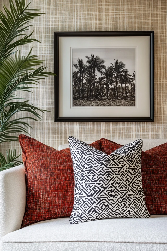
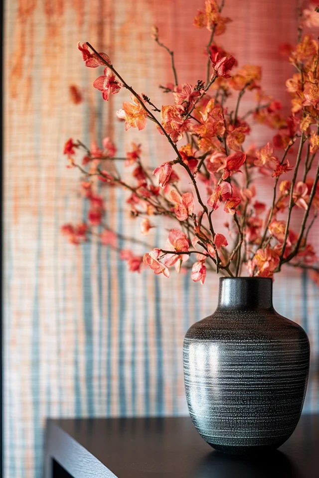
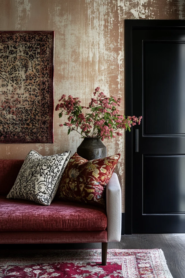
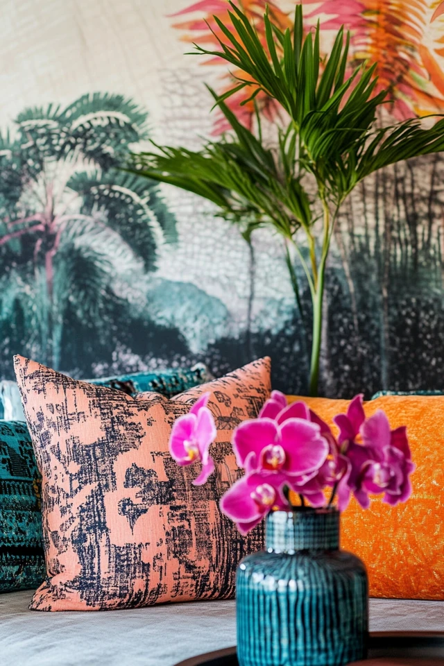
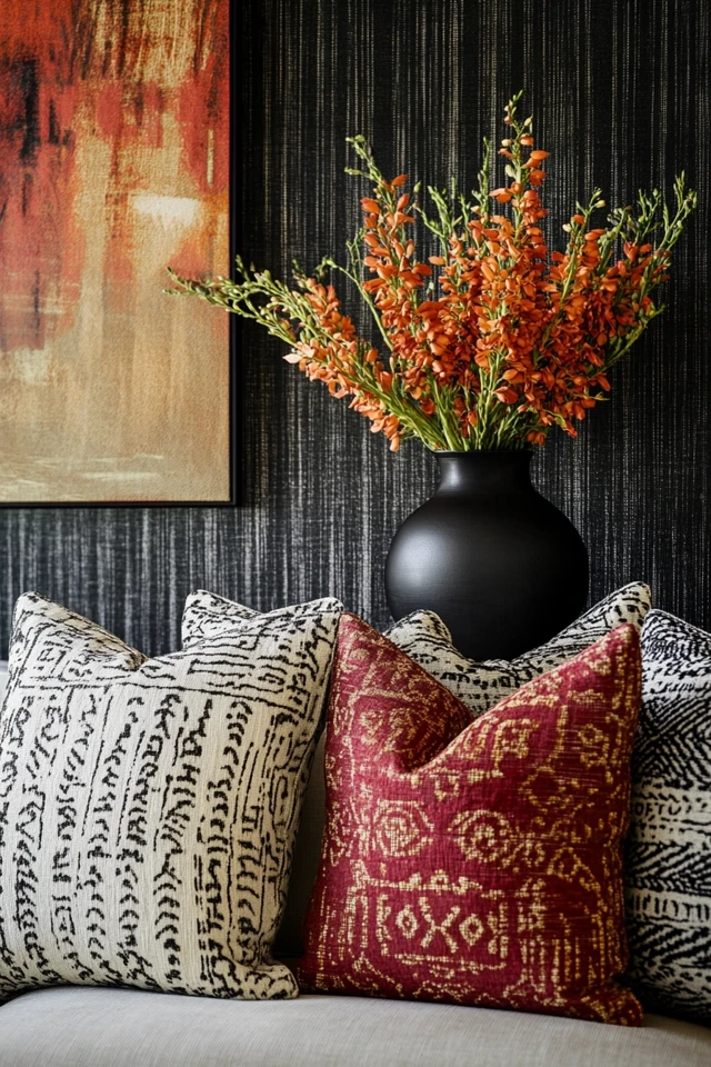
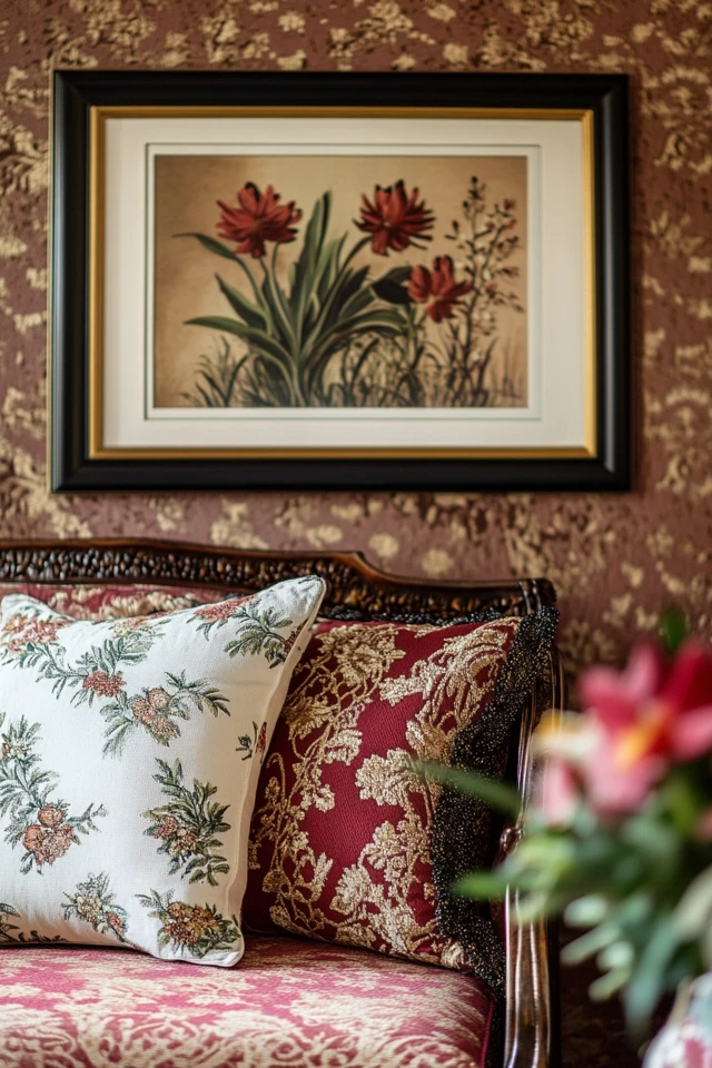
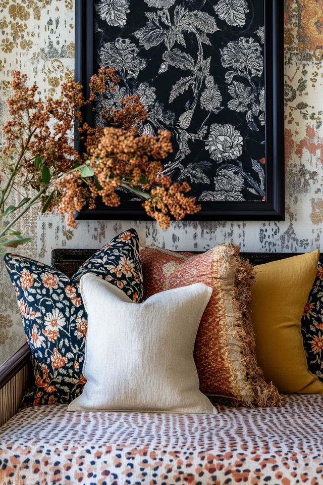
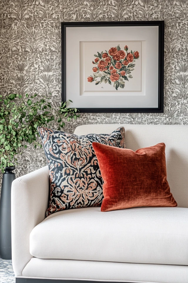
Picture Gallery

Conclusion
Using patterns and prints in an aesthetic room is a skill that, once mastered, can elevate your space from ordinary to extraordinary. Whether you’re experimenting with a bold geometric rug or layering subtle floral pillows, the key is balance. By understanding the basics of patterns, choosing a cohesive color palette, and thoughtfully layering elements, you can create a room that feels stylish, cohesive, and uniquely yours.
Looking back at my early design mistakes, I can see how much I’ve grown. Patterns no longer intimidate me—they’re my favorite way to add personality and depth to a room. So don’t be afraid to play! Mix those stripes with florals, layer textures, and let your creativity shine. The result will be a space that tells a story—your story.
FAQ
1. How do I mix patterns without clashing?
Stick to a consistent color palette, vary the scale of the patterns, and mix organic and structured designs for balance.
2. Can I use patterns in small spaces?
Yes! Opt for smaller-scale patterns or limit bold prints to one area, like a rug or a feature wall, to avoid overwhelming the space.
3. How do I incorporate patterns subtly?
Use patterns in smaller accents, like throw pillows, lampshades, or vases, to add a hint of visual interest without dominating the room.
4. What’s the best way to start using patterns?
Start with one bold patterned element, like a rug or wallpaper, and build the rest of the room around it using complementary solids and smaller patterns.
5. Can I use different patterns in every room?
Absolutely! Each room can have its own unique pattern story, as long as the overall home design feels cohesive through color or theme.

About the Author
M.Arch. Julio Arco is an architect, interior designer, and urban planner with degrees from ITESM, McGill University, and a certificate in Architecture in Urban Context from LDM. Julio has designed interiors for over 1,200 clients and also teaches architecture at ITESM.
He is also the founder of Habitari Interior Design, a blog dedicated to thoughtful, evidence-based spaces that elevate everyday living.
His go-to sites for inspiration include Houzz, Apartment Therapy, HGTV, Architectural Digest, and The Spruce.